Call Us Today

Decorating a room isn't just about the final reveal; it's the exhilarating journey of transforming a blank canvas. Choosing the perfect room palette is a cornerstone of this adventure, a chance to unleash your creativity and bring your vision to life.
Remember the excitement of spreading out paint chips, a vibrant spectrum of possibilities at your fingertips? But before you dive headfirst, there's a powerful tool waiting to be rediscovered: the color wheel. This isn't just a relic from elementary school art class; it's a key to unlocking harmonious color combinations and creating a stunning space.
In this guide, we'll explore the color wheel's secrets and empower you to master the art of choosing room palettes for your next home project.
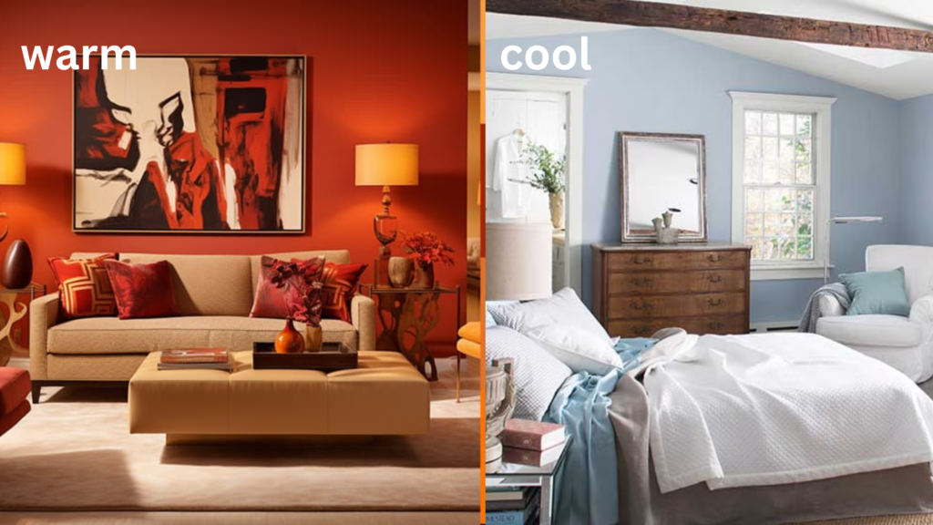
The color wheel is exactly as it sounds: a circular diagram that displays a range of colors. It usually includes hues like red, orange, yellow, green, blue, purple, and magenta, resembling a rainbow. However, its true value lies in its design: Colors positioned directly across from each other on the wheel are known as complementary.
For instance, red complements green, yellow complements purple, and orange complements blue.

Complementary colors achieve a striking effect by maximizing contrast. These pairs sit at opposite ends of the color spectrum, each enhancing the qualities of the other without clashing.
According to color specialist Leatrice Eiseman in her book The Complete Color Harmony, Pantone Edition, these combinations create a vibrant and impactful visual statement, showcasing each color's brightness and intensity.
Selecting the perfect room palette using the color wheel is a methodical approach that ensures harmony and visual appeal. Follow these steps to leverage the color wheel effectively:

Interior Designer Ashley Ferguson recommends using the "60-30-10" rule when selecting colors and their shades on the color wheel. According to Ferguson, this method involves choosing three colors: one to dominate 60% of the room, another for 30%, and a third for 10%. This approach ensures a balanced and harmonious feel in the space, which is helpful for choosing your room palette.
Ferguson advises using the color wheel to identify these main colors. For example, if a homeowner decides on a light or pale blue for their living room walls, they will designate this as the dominant color (60%). A darker navy could serve as the secondary color (30%), while a complementary moody orange would be used sparingly as accents (10%) to add depth and interest to the room.
“Complementary colors, by definition, enhance each other and sit opposite each other on the color wheel. So that just in and of itself can really create a vibrant effect when used together,” Ferguson says.
In a similar approach, she combines soft pink with Kelly green and accents them with a touch of vanilla for a soothing effect. Pink and red hues are opposite green on the color wheel. "These combinations are harmonious," Ferguson explains, "yet they create a bold and visually striking appearance as they contrast with each other."
Still unsure about choosing the right paint colors for your space? At Arclight Painting, we specialize in providing you with expert guidance and personalized recommendations tailored to your specific needs.
When you call Arclight Painting, you're not just hiring painters – you're partnering with Bothell's premier painting experts who are committed to delivering top-tier customer service. As a female veteran-owned and -operated company, we take pride in tackling even the toughest painting jobs with dedication and professionalism.
Whether you're looking for the perfect color scheme for your kitchen or seeking to revitalize your home's exterior, or perfecting your room palette, we're here to assist you every step of the way. Our team offers comprehensive services that include personalized color consultations and recommendations based on your preferences and the latest trends.
Contact us today for a free estimate and detailed timeline, and let Arclight Painting transform your vision into reality with confidence and care.
© 2024 Arclight Painting. All Rights Reserved. PRIVACY POLICY | SITEMAP